There’s no one-size-fits-all approach to User Experience design, and I adapt my methodology in every case as the scope can differ based on a number of factors.
I got started by engrossing myself in their current app and all of its features. With experience in Telecoms I was able to identify a lot of the pain points that were causing friction with users, and I also absorbed the reviews left on their app stores looking for any trends in negative feedback. User Experience extends across the entire customer journey, so it was still important to note points I might not have any control over, such as poor call quality.
There was also the opportunity to speak to some of their customers and observe them interacting with the app, which was vital to:
Observation also helped me pickup on subconscious actions, such as instinctively cancelling an error message without thinking about it, which aren’t usually revealed in interviews.
Using the insights gathered, I spent time with the project stakeholders taking them through my findings and sharing my recommendations. It’s vital that everyone is on the same page as this point; I like to ensure any concerns are raised and addressed. Once we were in agreement on the approach, I can confidently move onto execution.
I generated flow diagrams to visualise the journeys users took through the existing app to achieve their goal. From this it was possible to identify inefficiencies and problem areas, reinforced by the feedback already gathered from users, and draw up a new optimised version.
This often starts with very quick pen & paper sketches which I then move into a tool such as Omnigraffle for refinement and ease of sharing with stakeholders.
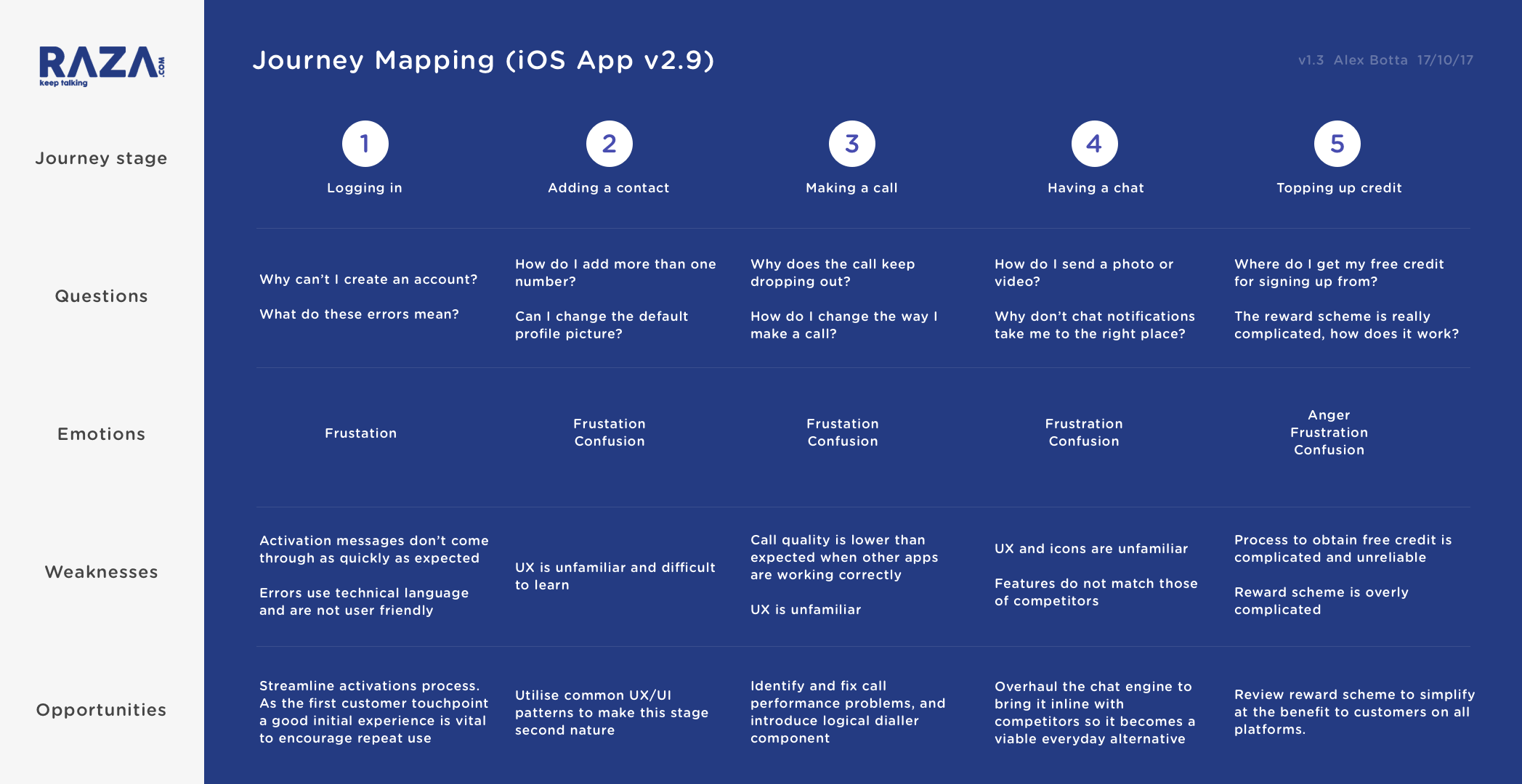
Example Journey Mapping
Confident that I’d identified the opportunities for improvement, I moved onto the first round of wireframes. I typically use Sketch to produce these with wireframe libraries that speed up my workflow, although Balsamiq can also be a powerful tool by forcing the most simplistic interpretations. While sometimes tempting to move straight to high-fidelity designs, wireframes are quicker to create, and more importantly, quicker to change as you iterate them. They’re also great to help avoid distractions around styling – at this stage what’s vital to nail down is the user experience.
With both iOS and Android apps to design, it was important to consider any variations between the two that would have any influence on the design, in order to follow the platform-centric approach that was agreed with the stakeholders to enable the apps to feel more familiar to both user bases.
Following initial wireframes and two rounds of amendments driven by in-depth reviews with the product team, I moved onto the final visual designs using Sketch. With a new brand being developed at Raza and the app being the first platform to implement it, they asked for a number of interpretations to choose from, and had provided at my request some examples of other apps they liked the style of to help form a view of what they were looking for.
The initial delivery for this stage was five screens designed from the wireframes, in four different styles that were in line with new branding. Following a presentation to business stakeholders, we selected a favourite and I made some additional refinements.
With the core screen and component designs agreed, I continued to work through the remaining required for development, creating templated components for reuse where possible to speed up development.


I am strong advocate of prototyping – it’s a powerful storytelling tool and an invaluable process in testing usability and interactivity. While there are many great options on the market, I tend to favour Proto.io due to its power and flexibility. For Raza, I created a simple prototype to help the product team make a decision on the mechanism to select call types. A solution was quickly selected with the help of Lookback, a UX research service I can trust when I don’t have other resources available, which gave us the ability to A/B test the two options.
A polished design is useless if it isn’t executed correctly, which is why I always pay close attention to the developer handover. Working closely (ideally sitting next to each other!) is the ideal way to ensure my designs are being interpreted correctly, while offering support to ensure design queries are never a blocker.
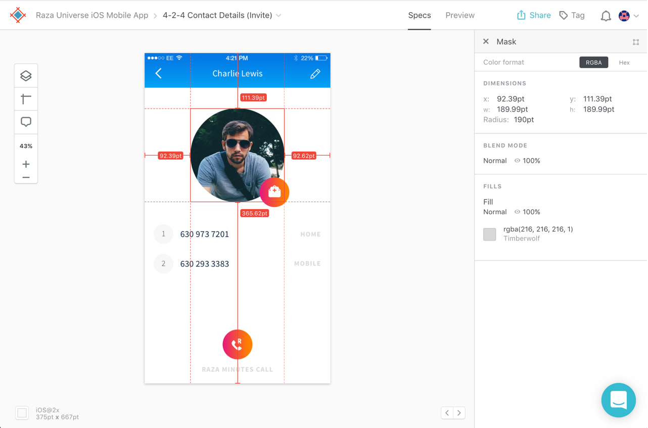
I used Sympli with Raza to automate the annotation of my designs and produce the required assets. Careful setup of my Sketch environment means vectors are exported in all the necessary densities to optimise the design for every device.
Throughout a development lifecycle, I’ll continually test the product to ensure the designs are implemented as intended; I will also ask to be included in UAT (User Acceptance Testing) to perform a final sweep. I take pride in my work and always want to see the best possible product go to market.


")
")
")